Tesla — Unofficial Logo Redesign Concept | Electric Cars, Solar & Clean Energy
This is an unofficial, non-commercial logo redesign concept for Tesla, Inc. — created purely as a personal design exploration and portfolio piece. It is not affiliated with, endorsed by, or submitted to Tesla in any capacity.
CONCEPT
Tesla doesn't need decoration. It needs inevitability.
This redesign strips the Tesla identity down to its engineering core — removing every visual shortcut and rebuilding the mark from first principles. The result is a logo that doesn't ask for attention. It commands it.
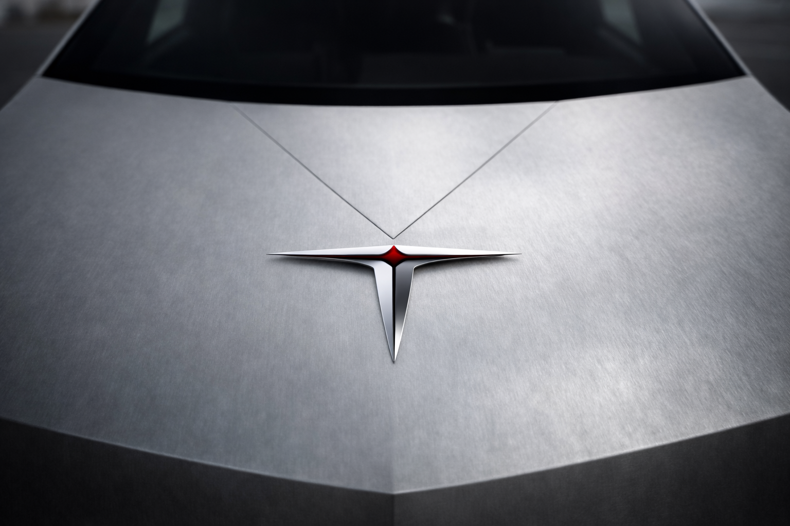
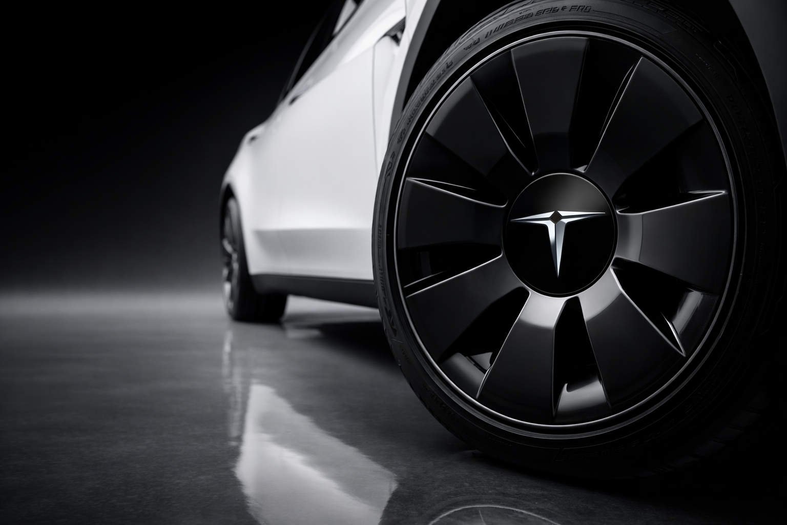
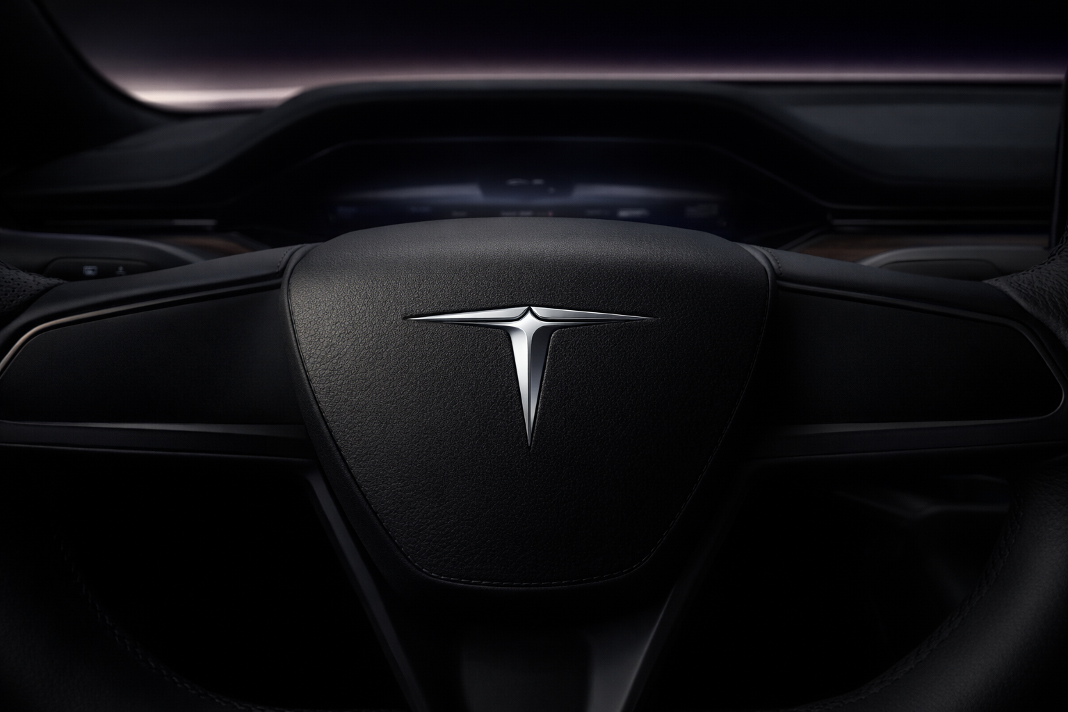
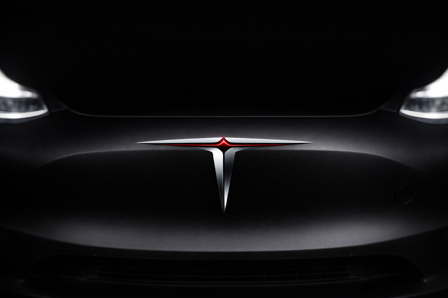
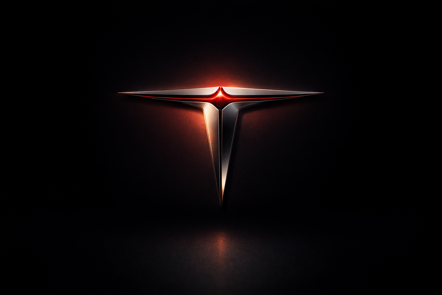
THE ICON
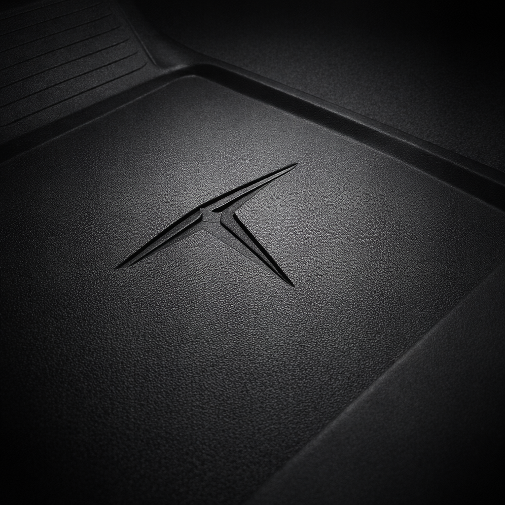
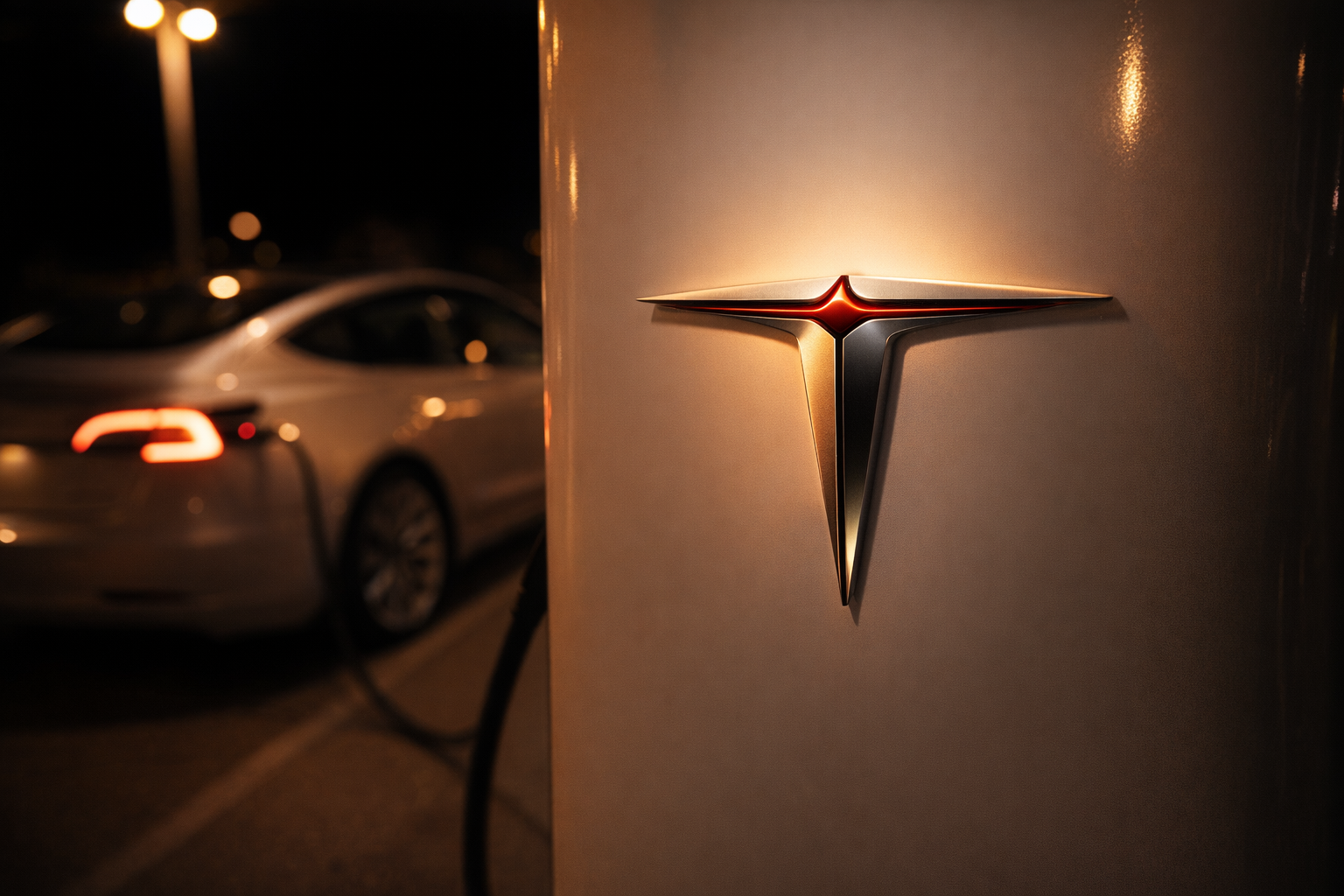
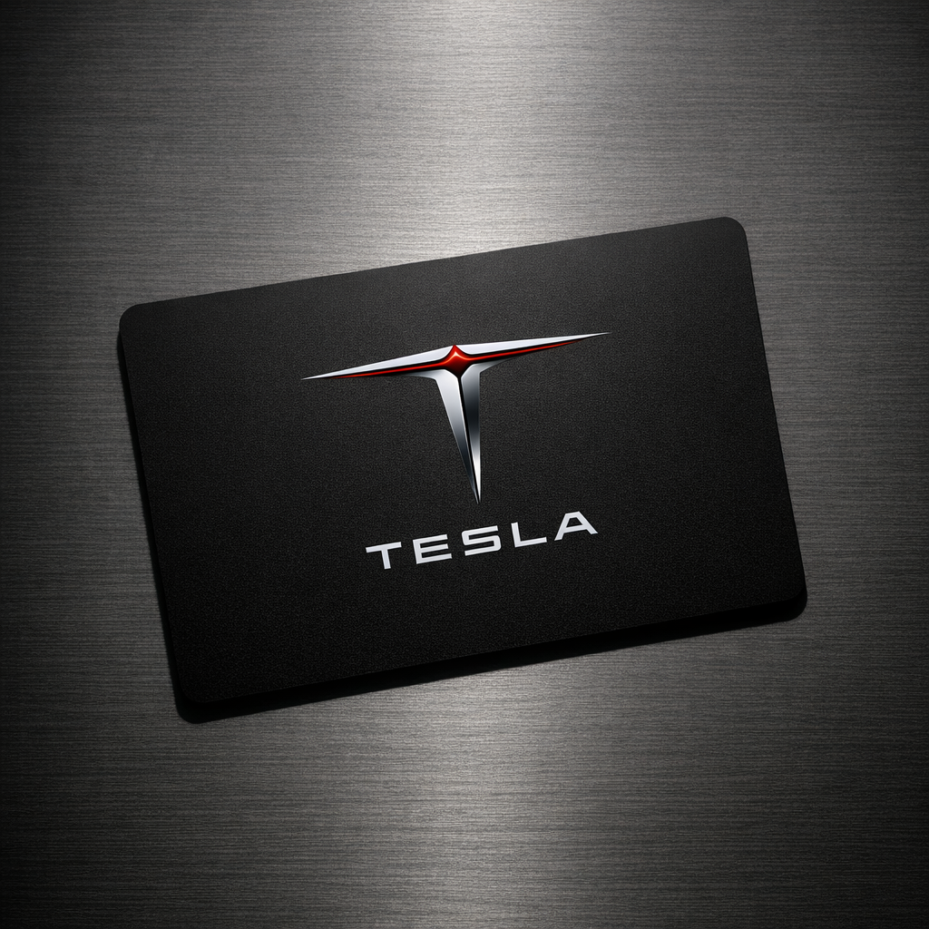
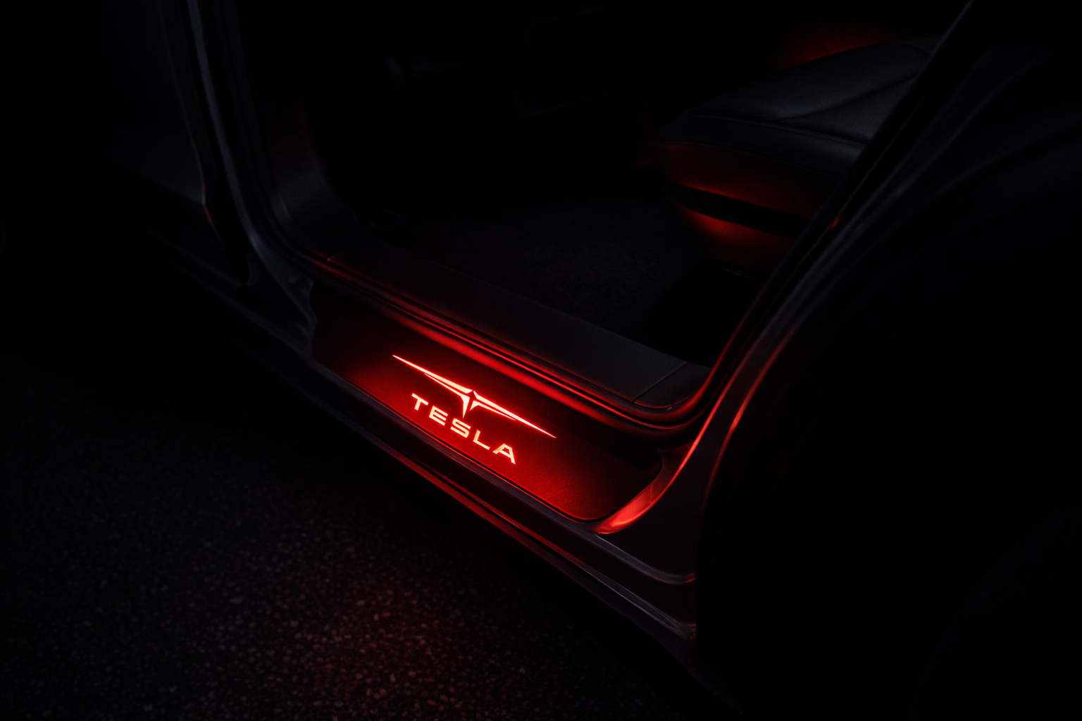
The central mark is a hyper-geometric letter 'T' — reengineered as a precision instrument rather than a letterform.
The horizontal crossbar is extended and razor-thin, tapering to needle-sharp points at both ends — as if charged with electrical tension and ready to arc. The vertical stem descends with a subtle inward taper, projecting downward velocity and grounded power.
A single clean electric arc splits through the crossbar's center — not as decoration, but as structure. The mark directly references the cross-section of an electric motor's rotor, rendered with engineering exactness. This is a logo that means something before you read it.
No frame. No enclosure. The icon breathes in open space, commanding authority through pure geometric confidence.
THE WORDMARK
TESLA is set in a custom ultra-wide geometric sans-serif — machined, not drawn. Consistent stroke weight. Zero personality flourishes. Wide letter-spacing with generous air between each character, projecting scale, silence, and absolute precision.
COLOR SYSTEM
Primary — Velocity Black Background: Deep matte black ▉ #0A0A0A Icon: Sharp chrome-to-pure-white gradient, top to bottom Arc detail: One precise hair-thin line of electric crimson ▉ #CC0000 Wordmark: Flat white ▉ #F5F5F5 — no gradient, no shadow, no effect
DESIGN PRINCIPLES
Negative space is not an afterthought — it is a design element. The logo holds full authority at favicon scale and at full billboard scale without modification.
Style references: Swiss International Typographic Style · Aerospace mission patch lettering stripped of all ornament · Premium automotive badge engineering
No circles. No shields. No rounded containers. No drop shadows. No lens flares. No gradients on the wordmark.