The Concept
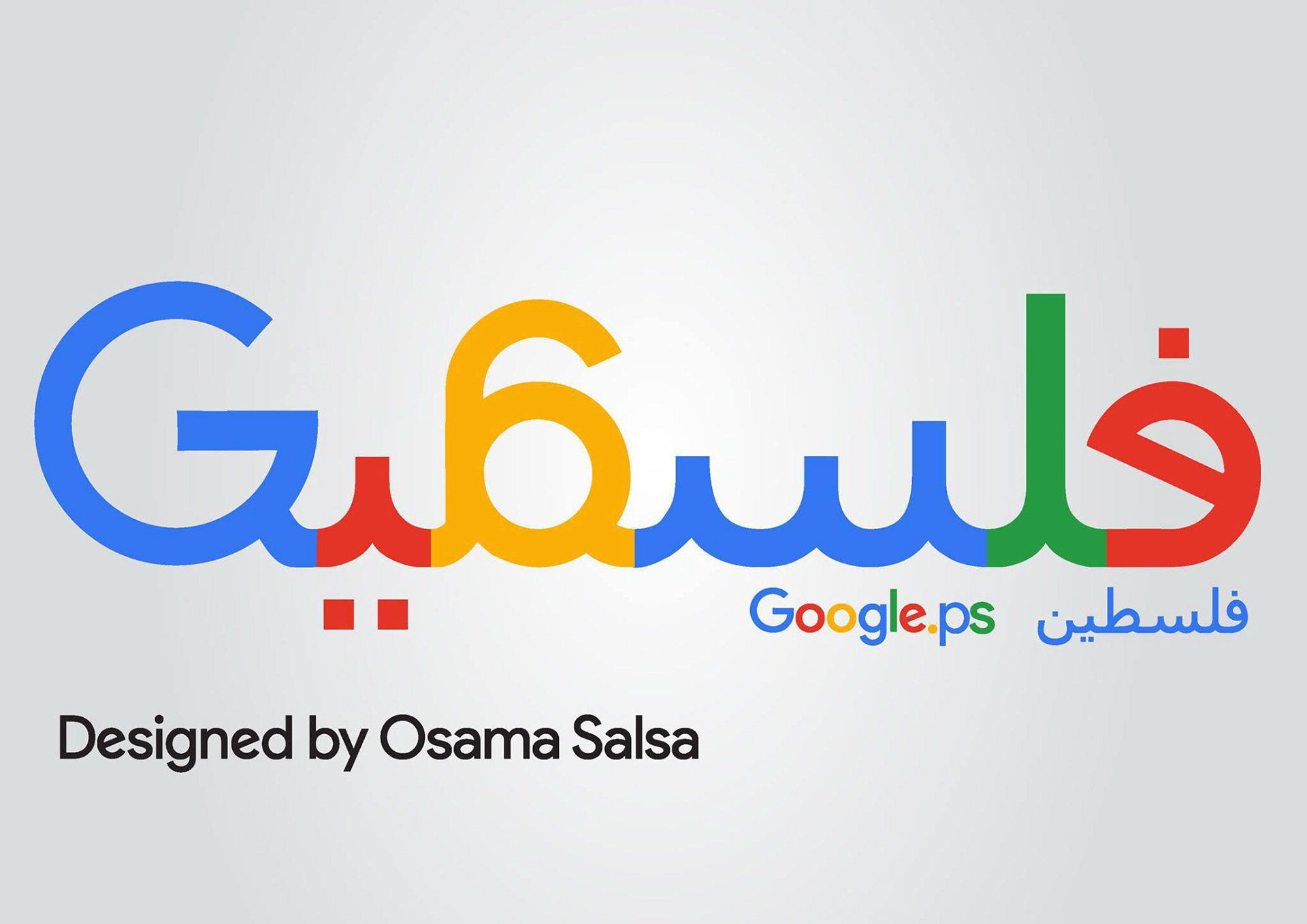
What if Google wrote its name in Arabic — and that name was Palestine?
This project is a typographic exploration and a statement of cultural identity. The word فلسطين is redesigned letter by letter to match Google's iconic rounded geometry, weight, and four-color system — blue, red, yellow, and green — the same colors that also appear in the Palestinian flag.
The coincidence is powerful: Google's colors are Palestine's colors.
Design Approach
The challenge was to adapt Arabic letterforms — which are cursive, connected, and right-to-left — into Google's Latin-inspired geometric style without losing legibility or cultural authenticity.
Each Arabic letter was carefully crafted to:
Match Google's stroke weight and rounded terminals
Flow naturally as connected Arabic script
Carry Google's exact color sequence across the word
Integrate with the Latin "G" on the left side
The result is a bilingual, bicultural logo that feels both completely Google — and completely Palestinian.
Design Details
Color Palette: Google Blue ▉ #4285F4 · Google Red ▉ #EA4335 · Google Yellow ▉ #FBBC05 · Google Green ▉ #34A853
Typography Style: Custom Arabic lettering inspired by Google Sans geometry
Layout: RTL Arabic script + LTR Latin "G" — unified in one wordmark
Secondary lockup: Google.ps فلسطين — referencing Palestine's official internet domain
This is not just a logo redesign. It's a reminder that Palestine exists — on the map, on the internet, and in every pixel.