A modern reinterpretation of one of English football's most historic clubs.
Preston North End holds a legendary place in football history — the first-ever English league champions and the original "Invincibles." This redesign concept pays tribute to that extraordinary legacy through a clean, contemporary visual identity that honors tradition while looking firmly toward the future.
The goal was simple: distill over 140 years of footballing heritage into a single, powerful, unforgettable mark.
The Concept
This logo redesign reimagines Preston North End's iconic identity through the lens of modern minimalism. Every element has been carefully considered and stripped down to its purest geometric form while maintaining the emotional resonance and historical significance that supporters cherish.
The design philosophy centers on three core principles:
→ Heritage: Deep respect for the club's storied past
→ Clarity: Immediate recognition at any size
→ Versatility: Flawless performance across all applications
→ Clarity: Immediate recognition at any size
→ Versatility: Flawless performance across all applications
The result is a bold, confident mark that feels both timeless and thoroughly modern — a logo worthy of the club that started it all.
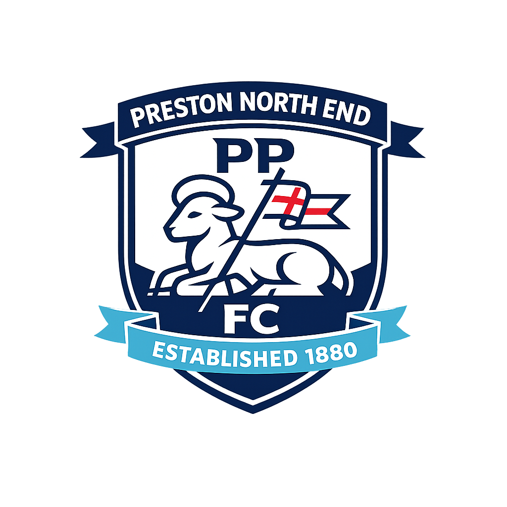
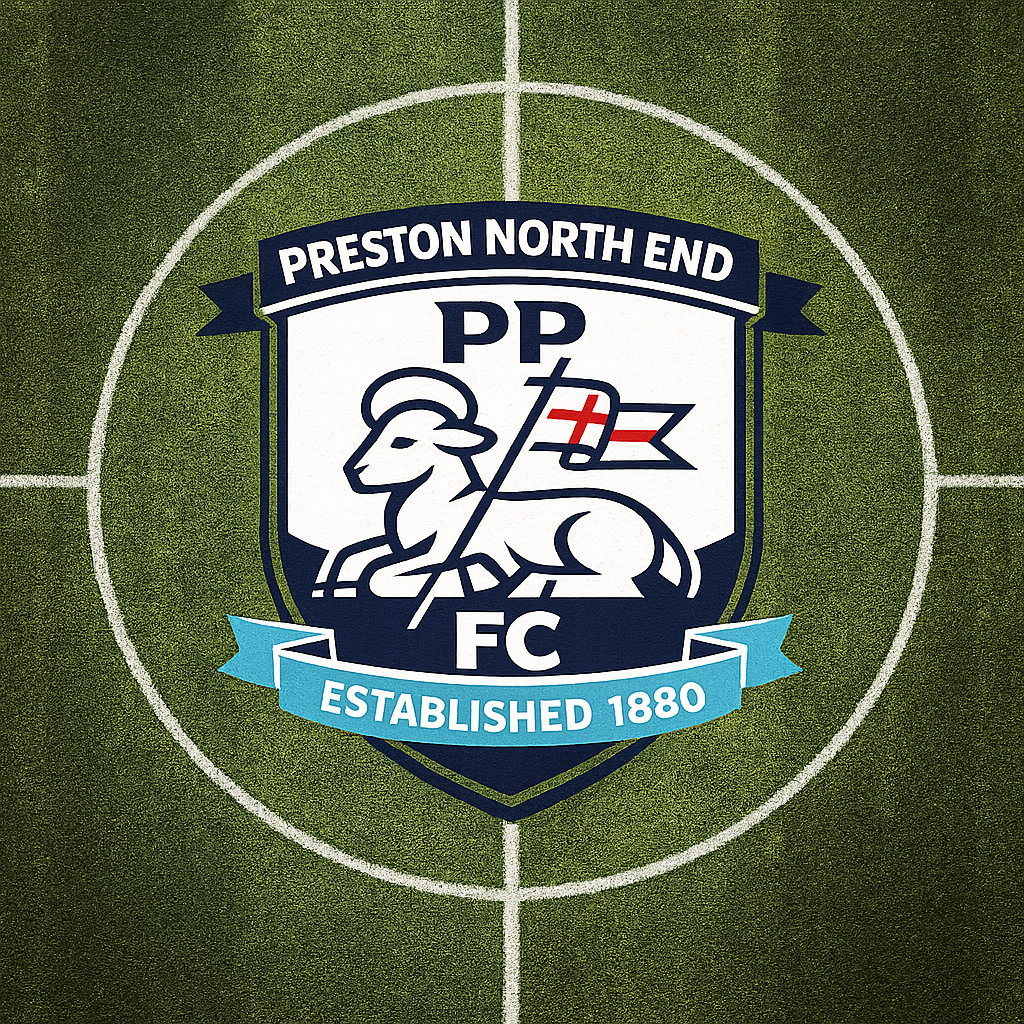
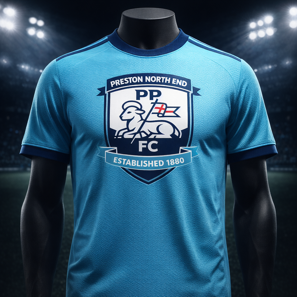
The Paschal Lamb
At the heart of this design stands the paschal lamb — Preston's most enduring symbol, drawn directly from the city's historic coat of arms. Traditionally depicted holding a banner, the lamb represents sacrifice, resilience, and unwavering faith.
In this redesign, the lamb has been reimagined through a stylized, geometric approach. Unnecessary detail has been removed. What remains is a powerful, iconic silhouette that communicates instantly — whether displayed on a stadium facade or stitched onto a jersey sleeve.
The lamb stands tall and proud, banner raised, embodying the fighting spirit that has defined this club since 1880.
The Shield
The shield serves as the structural foundation of the entire mark. Its form is compact, angular, and decisively modern — a departure from ornate traditional crests while still unmistakably heraldic in character.
The shield shape achieves two things simultaneously:
- It anchors the composition with authority and stability
- It signals belonging to the proud tradition of English football heraldry
Every proportion has been carefully calibrated to ensure visual balance and harmony between the shield frame and the elements contained within it.
The Ribbon & Founding Year
A cyan ribbon bearing the words "ESTABLISHED 1880" wraps across the lower portion of the design. This element serves as both a decorative accent and a proud declaration.
1880 Before any other club won the league. Before football as we know it truly existed. Preston North End was there at the very beginning — and this ribbon ensures that no one ever forgets it.
The cyan color provides a subtle but striking contrast against the deep navy, adding a contemporary accent that lifts the overall palette.
Color System
The palette has been deliberately restrained to maximize impact and versatility:
▉ Deep Navy Blue — #0A1628
→ Primary color. Authority, tradition, depth. The dominant tone that gives the logo its commanding presence.
→ Primary color. Authority, tradition, depth. The dominant tone that gives the logo its commanding presence.
▉ Pure White — #FFFFFF
→ Secondary color. Clarity, precision, contrast. Creates the breathing room that makes the design legible at every scale.
→ Secondary color. Clarity, precision, contrast. Creates the breathing room that makes the design legible at every scale.
▉ Bright Red — #E3212D
→ Accent color. Passion, energy, courage. Used sparingly for maximum impact, this red ignites the composition.
→ Accent color. Passion, energy, courage. Used sparingly for maximum impact, this red ignites the composition.
▉ Cyan — #00B4D8
→ Ribbon accent. Freshness, modernity, distinction. The unexpected element that makes this palette uniquely memorable.
→ Ribbon accent. Freshness, modernity, distinction. The unexpected element that makes this palette uniquely memorable.
This four-color system is designed to work in full color, two-color, and single-color applications without losing any of its visual power.
Design DNA
Every decision in this project was guided by clear principles:
✦ Flat Design — No gradients, no shadows, no unnecessary effects. Pure form and color.
✦ High Contrast — Bold tonal relationships ensure the logo commands attention in any environment.
✦ Clean Lines — Every curve and angle has been refined to geometric precision. Nothing is arbitrary.
✦ Vector-Built — Created entirely in vector format for infinite scalability without quality loss.
✦ No Noise — If an element doesn't earn its place, it doesn't exist. Every stroke serves a purpose.
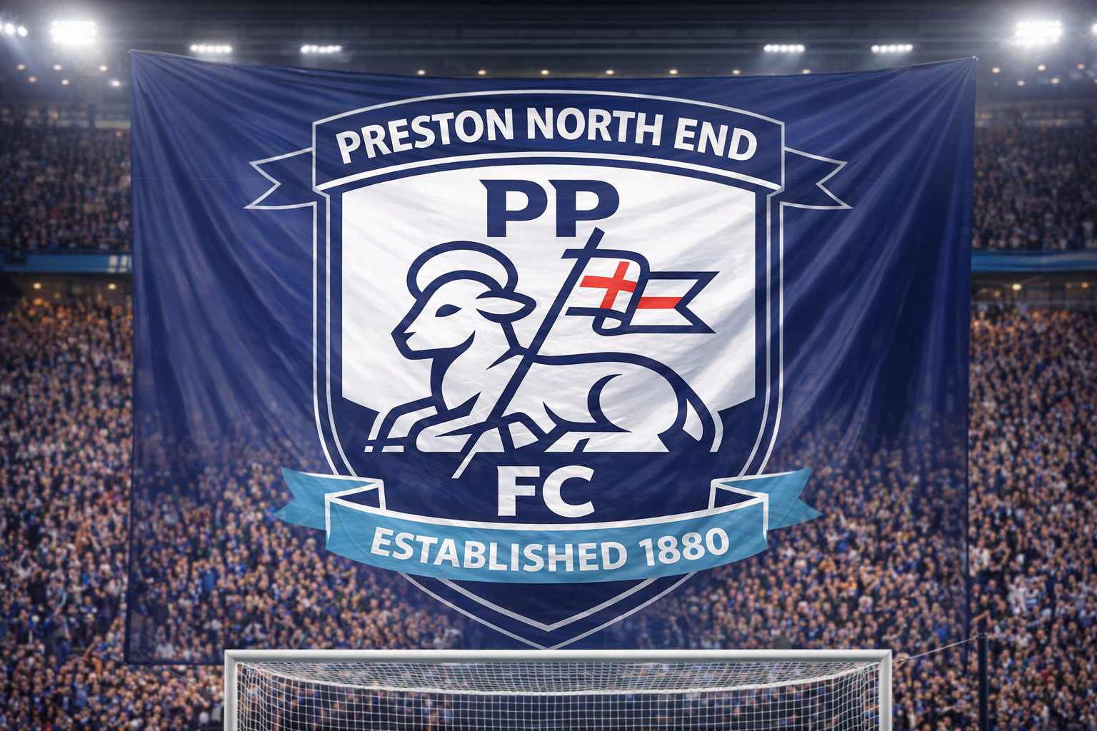
The result is a logo that reads as clearly on a 5mm pin badge as it does on a 50-meter stadium banner.
Built for the Real World
A logo only succeeds if it works everywhere. This design has been stress-tested across the full spectrum of real-world applications:
Physical Applications:
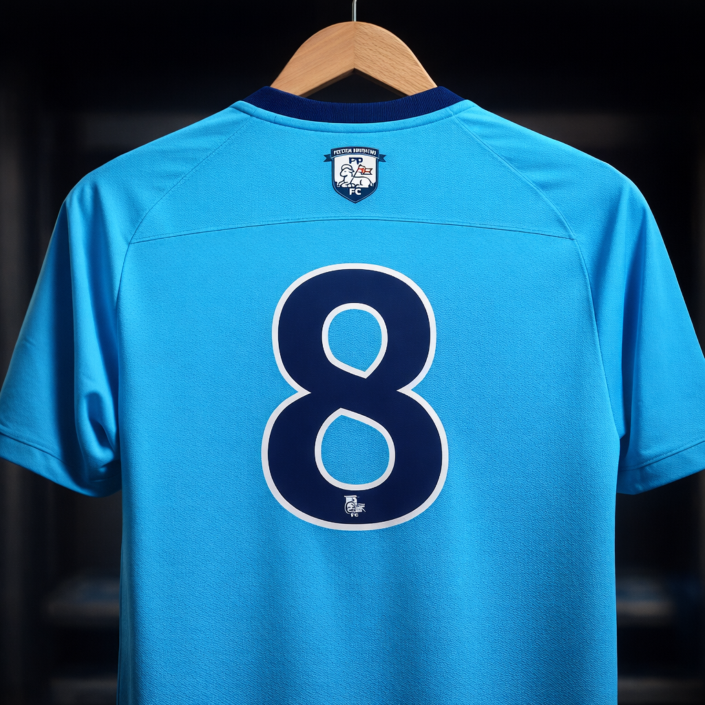
→ Jersey embroidery (chest badge and sleeve)
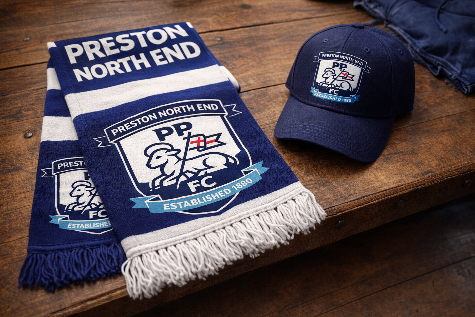
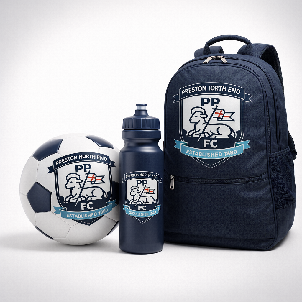
→ Scarves, hats, and merchandise
→ Stadium signage and wayfinding
→ Printed match-day programs
→ Enamel pin badges
→ Engraved metal and glass
→ Jersey embroidery (chest badge and sleeve)
→ Scarves, hats, and merchandise
→ Stadium signage and wayfinding
→ Printed match-day programs
→ Enamel pin badges
→ Engraved metal and glass
Digital Applications:
→ Website headers and footers
→ Social media profile pictures and banners
→ Mobile app icons
→ Animated broadcast graphics
→ Email signatures
→ Digital ticketing
→ Website headers and footers
→ Social media profile pictures and banners
→ Mobile app icons
→ Animated broadcast graphics
→ Email signatures
→ Digital ticketing
The flat, geometric construction ensures crisp rendering at any resolution, and the high-contrast color system guarantees visibility against virtually any background.
Final Thoughts
Preston North End isn't just another football club. It's the football club — the one that proved a league could work, that dominance was possible, that this beautiful game could captivate an entire nation.
A club with that history deserves an identity that matches its stature: bold, confident, unmistakable, and built to last another 140 years.
This is a personal concept project created out of admiration for Preston North End FC and the craft of sports identity design. It is not affiliated with or endorsed by the club.