About the Project
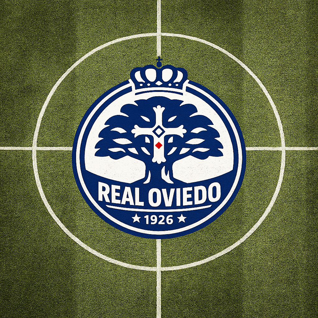
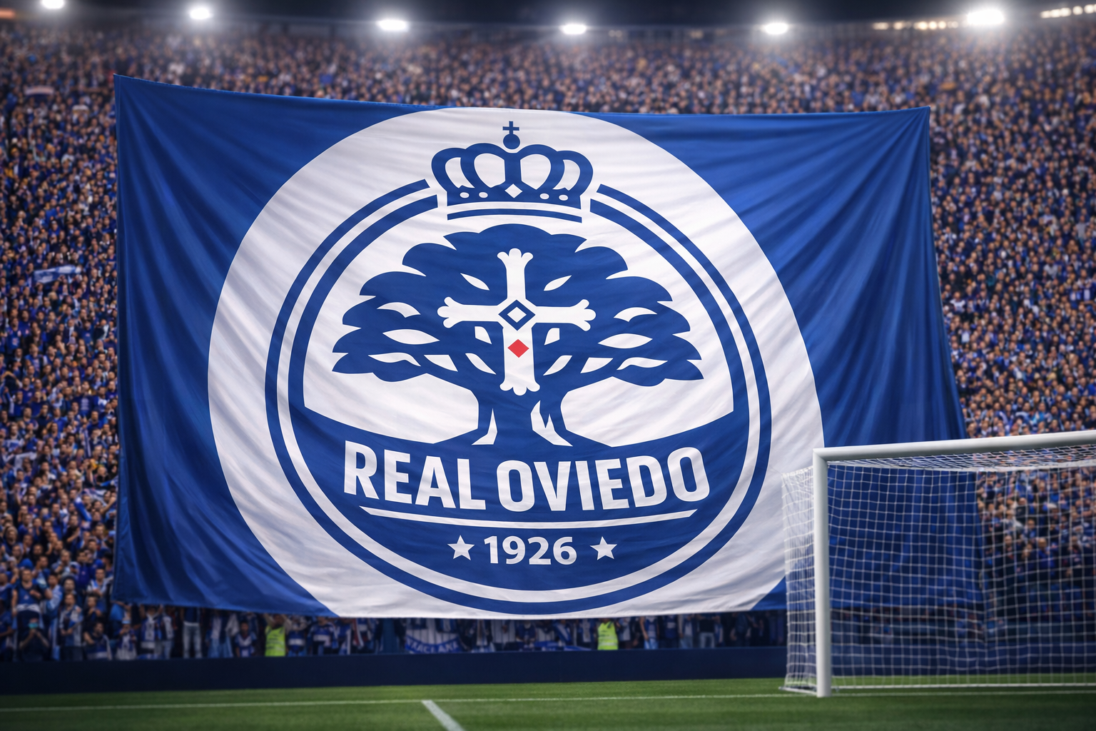
A modern reinterpretation of Real Oviedo's visual identity, honoring the club's rich heritage while creating a bold, contemporary emblem fit for the modern game. This redesign balances tradition with timeless minimalism, creating a prestigious mark that stands strong across all applications.
The Challenge
Real Oviedo, founded in 1926, needed a logo that:
- Honors Asturian heritage and the iconic carbayón (oak tree)
- Incorporates the historic Cross of Victory
- Reflects royal prestige through the crown
- Works effectively at any scale, from stadium banners to mobile screens
- Maintains athletic authority while feeling modern and refined
Design Concept
The logo centers on three core symbolic elements:
The Carbayón (Oak Tree) - A stylized representation of Oviedo's legendary oak tree, symbolizing strength, endurance, and deep roots in the community.
The Cross of Victory - Subtly integrated within the tree's structure, representing Asturias' historical significance and the club's fighting spirit.
The Royal Crown - An elegant, simplified crown acknowledging the "Real" (Royal) designation, positioned proudly above the emblem.
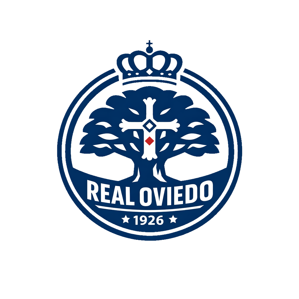
Design Elements
Shape & Structure
- Circular badge format with bold double border for maximum impact
- Perfectly balanced composition with crown, tree, text, and foundation year
- Geometric precision throughout for clean reproduction
Typography
- Bold, condensed sans-serif for "REAL OVIEDO" ensuring legibility
- Integrated year mark "1926" with decorative stars
Symbolism
- Tree canopy flows organically while maintaining structured symmetry
- Trunk incorporates the Cross of Victory geometry
- Single red diamond accent at the heart of the cross
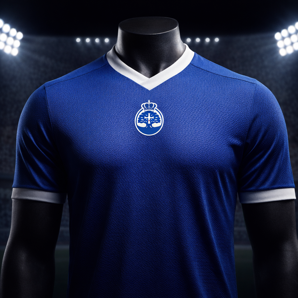
Color Palette
- Oviedo Blue (Navy) - Deep, authoritative blue representing tradition and prestige
- White - Clean contrast for maximum clarity and modern appeal
- Victory Red - Strategic accent honoring the Cross of Victory
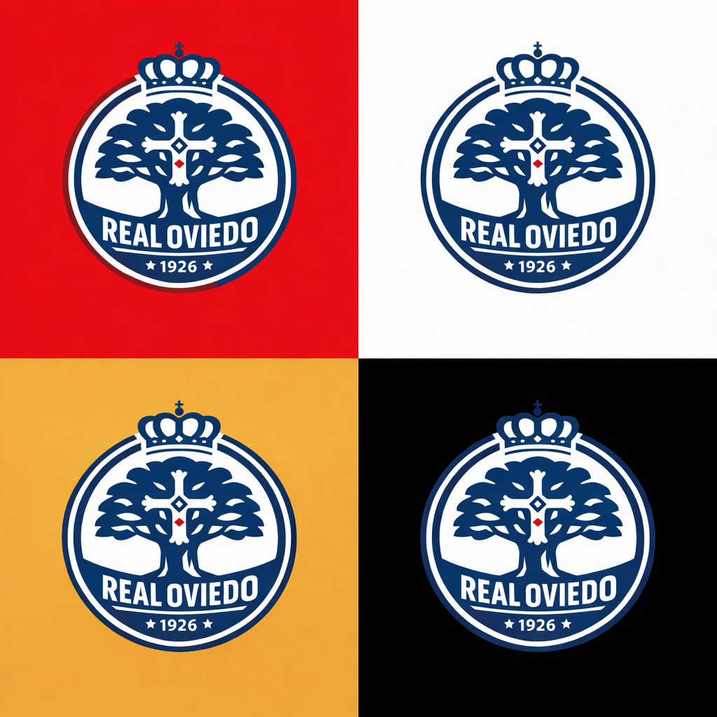

Design Approach
Flat Vector Design - No gradients, shadows, or effects. Pure, scalable vector graphics that work at any size.
High Contrast - Navy and white create bold visibility perfect for stadium environments, broadcast, and digital platforms.
Timeless Aesthetic - Avoiding trends in favor of classic badge design principles that will remain relevant for decades.
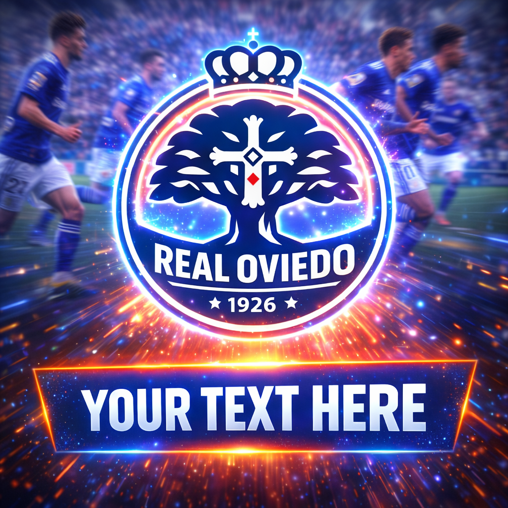
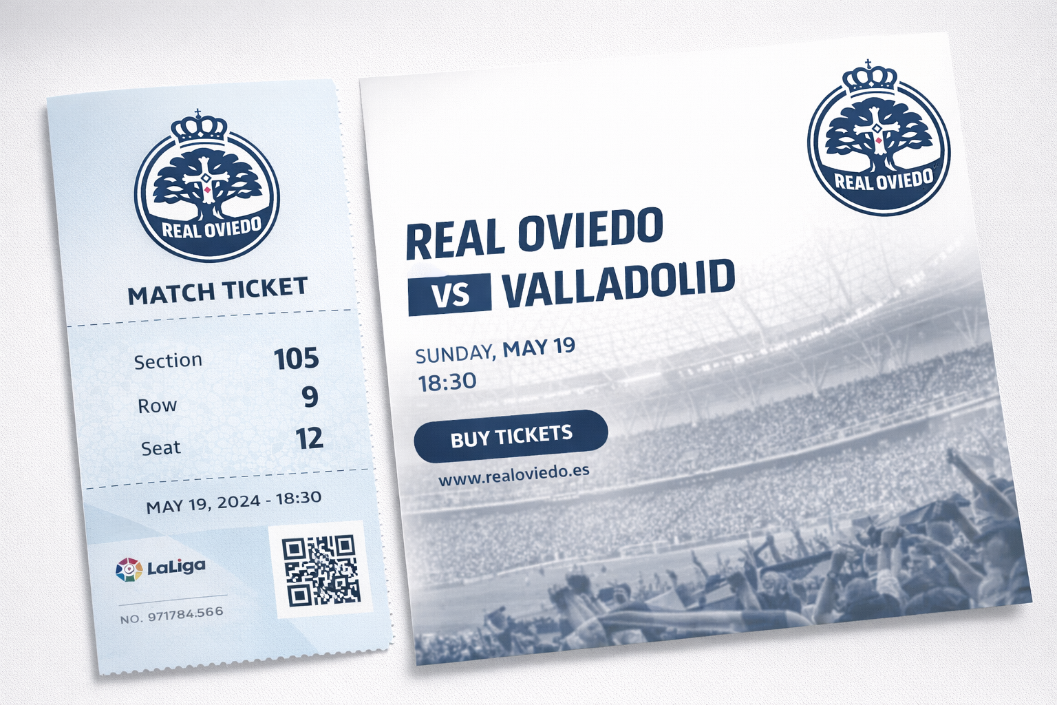
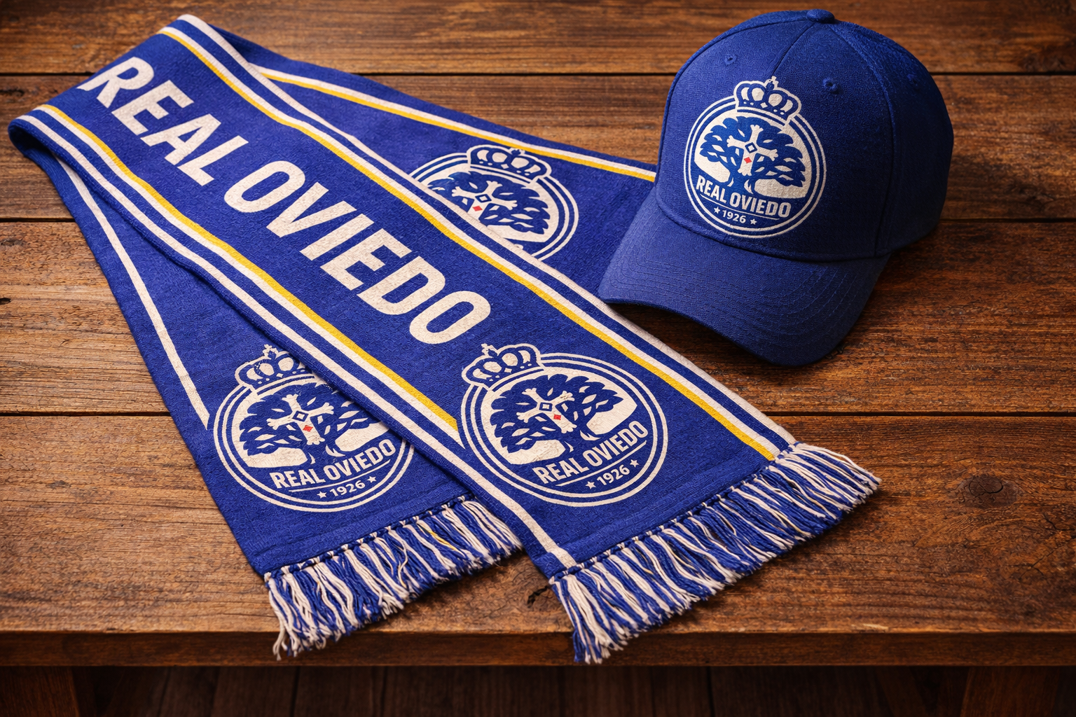
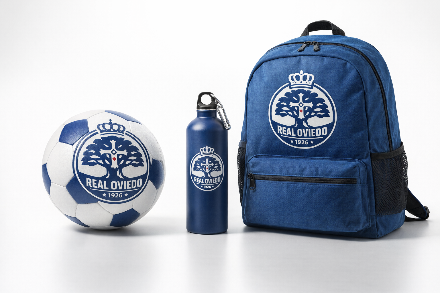
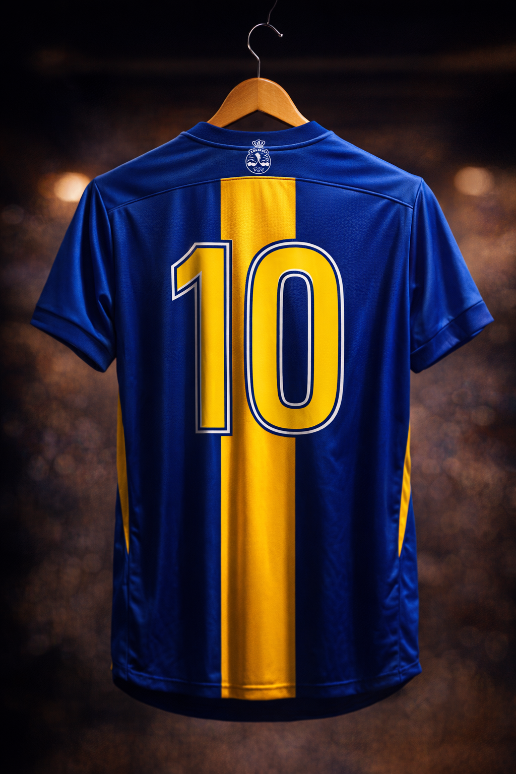
Applications
This versatile mark works seamlessly across:
- Kit badges and stadium signage
- Digital platforms and social media
- Merchandise and promotional materials
- Broadcast graphics and mobile apps

Final Thoughts
This redesign respects Real Oviedo's century of history while giving the club a powerful, modern identity. The logo is authoritative yet accessible, prestigious yet passionate—a true reflection of the club and its loyal supporters.
Year: 2026
Client: Real Oviedo (Concept)
Services: Logo Design, Brand Identity
Client: Real Oviedo (Concept)
Services: Logo Design, Brand Identity
This is a personal concept project created out of admiration for Real Oviedo FC and the craft of sports identity design. It is not affiliated with or endorsed by the club.