THE BRIEF
Design a professional, modern emblem-style crest for Coventry City Football Club that:
→ Feels contemporary yet respects over 140 years of club history
→ Works at every scale — from stadium signage to embroidered kits
→ Merges the club's two iconic symbols — the Phoenix and the Elephant — into one unified mark
→ Remains clean, flat, and fully vector-based with zero gradients
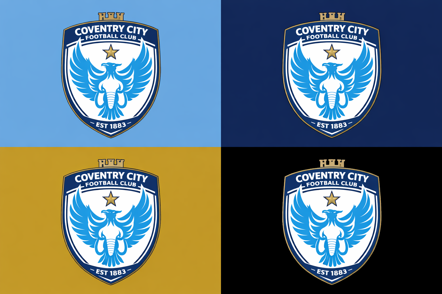
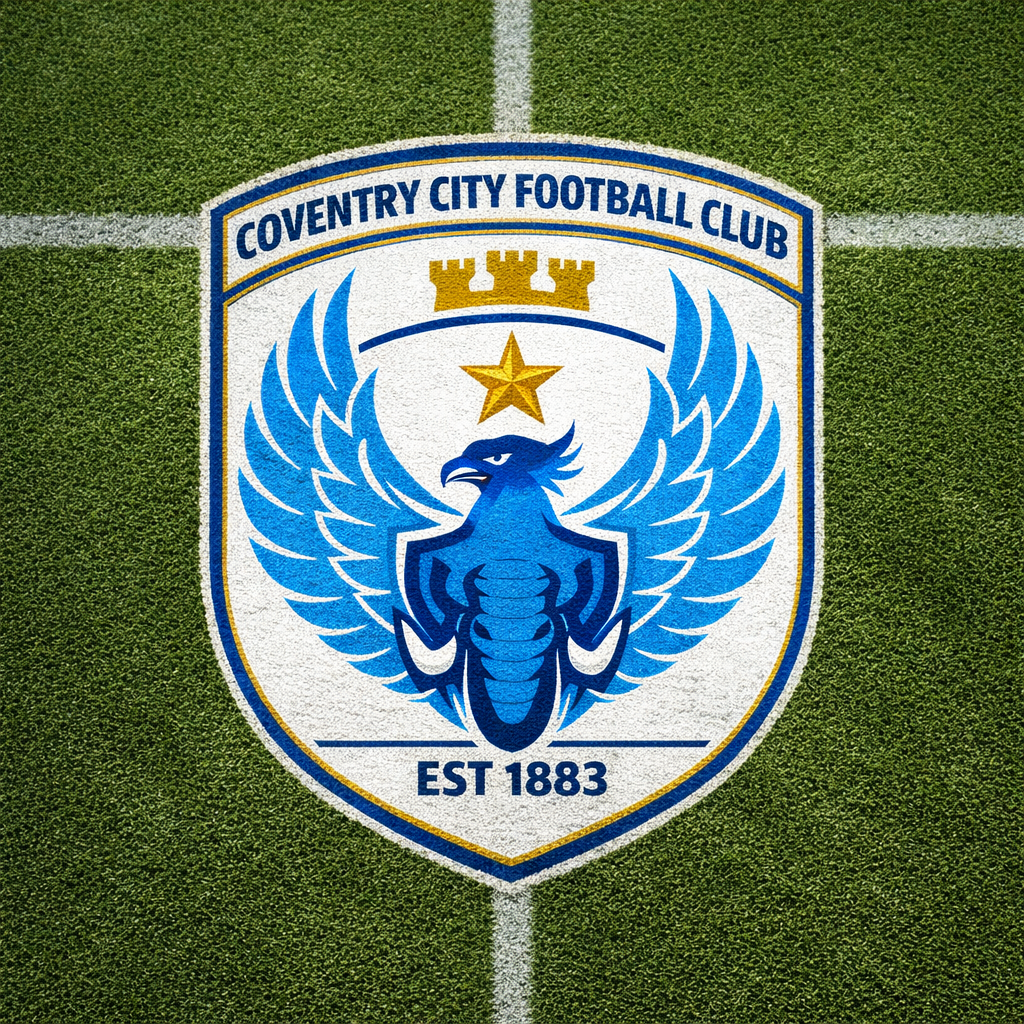
CONCEPT & SYMBOLISM
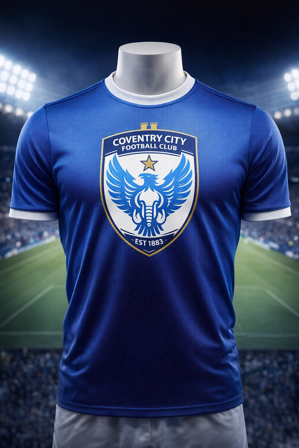
Every detail in the crest has been carefully considered:
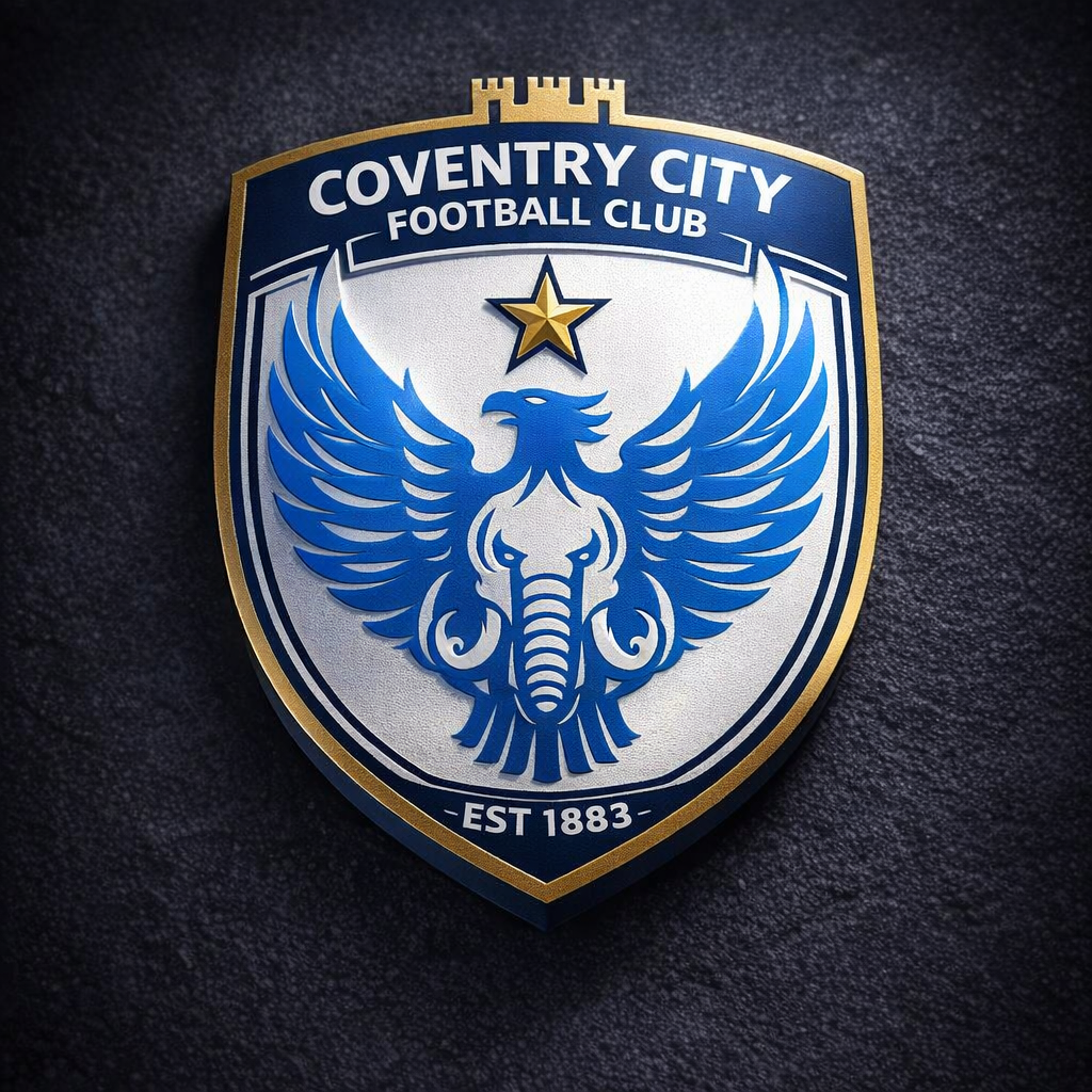
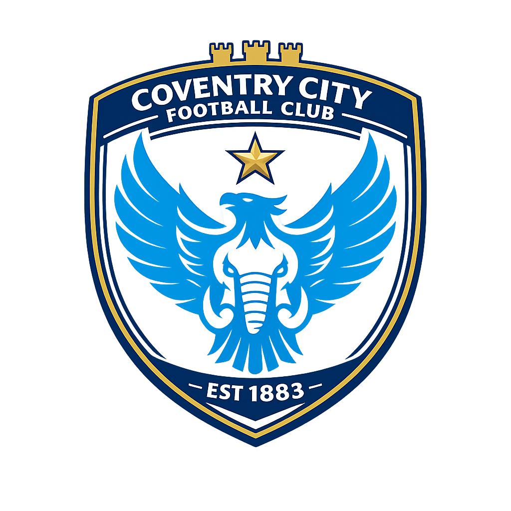
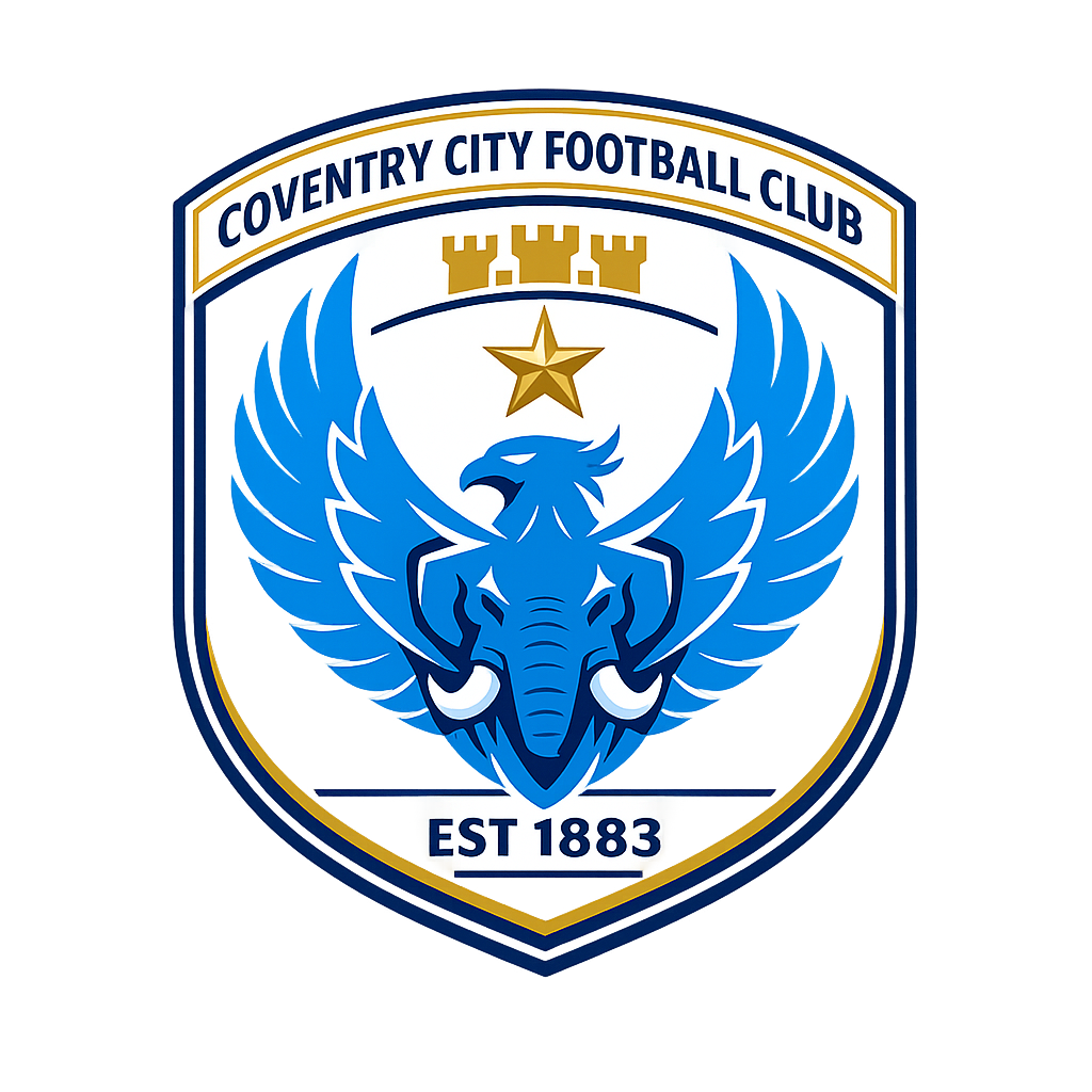
- THE PHOENIX The centrepiece — a majestic phoenix rising with wings spread upward. It represents Coventry's legendary ability to rise from the ashes, most notably after the devastating Blitz of 1940 and the club's own journey through the football leagues.
- THE ELEPHANT Cleverly integrated into the phoenix's chest and wing structure through negative space, the heraldic elephant pays tribute to Coventry's historic coat of arms and the strength of the city and its people.
- THE STAR A proud five-pointed gold star sits above the phoenix, marking excellence and the club's FA Cup triumph — a crowning moment in its history.
- THE CASTLE SPIRES Three minimalist castle tower spires line the top of the shield, a direct reference to Coventry's medieval heritage and its iconic cathedral skyline.
- THE SHIELD A clean, rounded shield shape contains the entire composition, grounding it in the tradition of classic football heraldry while keeping the silhouette modern and versatile.
- THE OUTER RING "COVENTRY CITY FOOTBALL CLUB" arcs across the top and "EST 1883" anchors the bottom — proudly declaring the club's name and founding year.
COLOUR PALETTE
The palette is rooted in the Sky Blues' identity and enhanced with heraldic gold and deep navy for contrast and prestige.
▉ Sky Blue (Primary) — #57B8E8 The heart of Coventry City. Used for the phoenix and shield fill.
▉ White (Background) — #FFFFFF Clean, open, lets the crest breathe.
▉ Gold (Accent) — #D4A843 Star and key outlines. Adds a premium, trophy-worthy edge.
▉ Navy Blue (Strokes & Text) #0C2340 Outer ring, typography, and structural strokes for contrast and legibility.
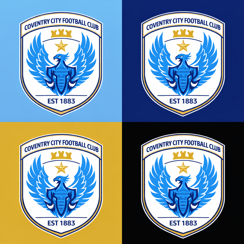
TYPOGRAPHY & CONSTRUCTION
The ring text uses a bold, condensed sans-serif typeface set on a circular path — chosen for maximum legibility at small sizes and a strong, athletic feel.
The entire crest is built on a strict symmetrical grid to ensure perfect balance. All curves and angles are geometrically precise, making the mark infinitely scalable from a favicon to a stadium banner without any loss of clarity.
Design constraints honoured:
✓ Fully vector — 100% scalable
✓ Zero gradients — flat colour only
✓ Embroidery-ready — no details thinner than 1 mm at badge size
✓ Symmetrical & balanced
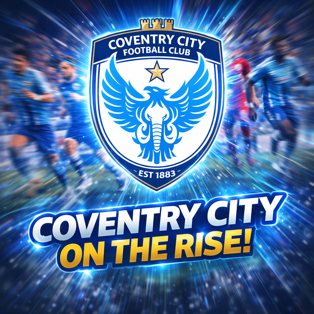
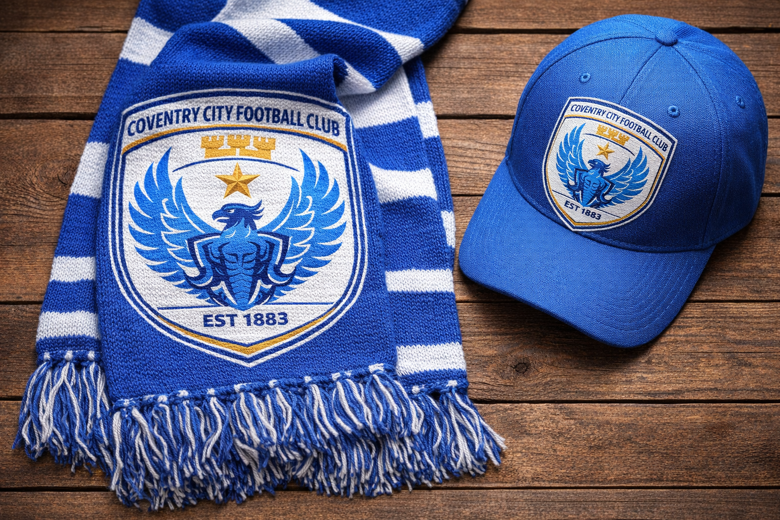
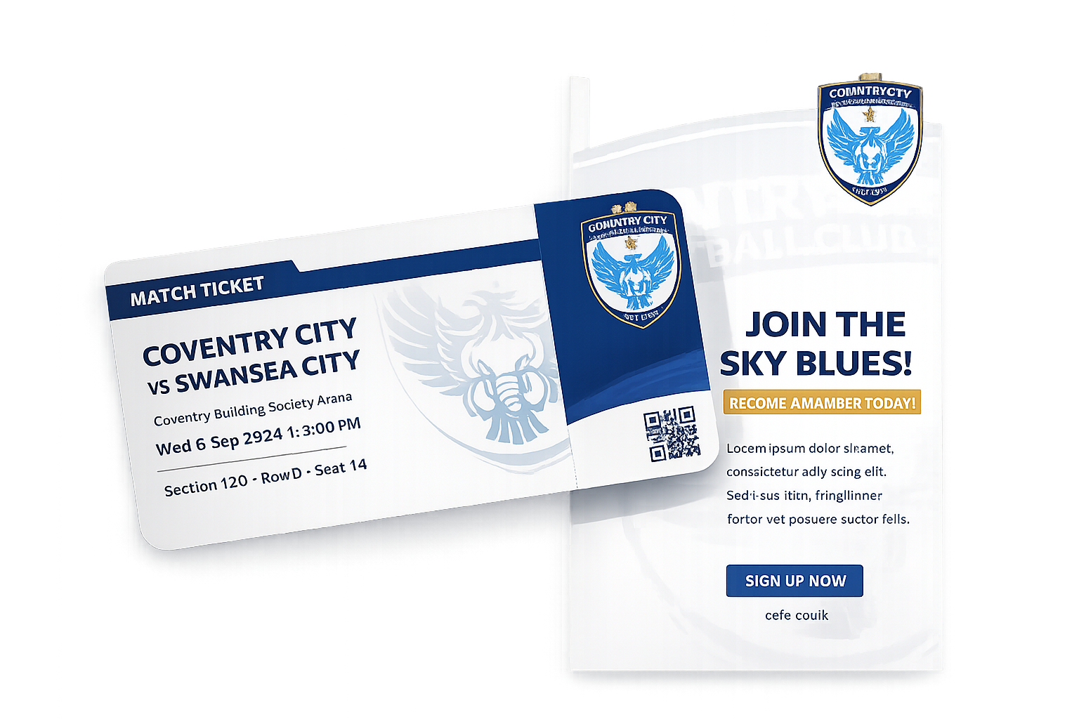
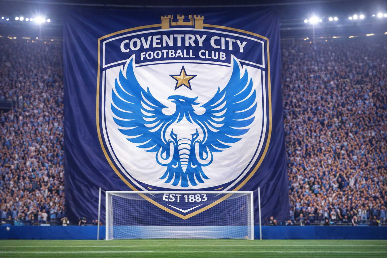
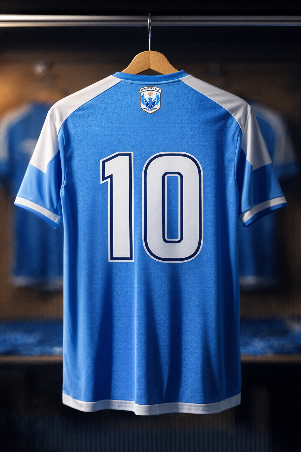
APPLICATIONS
A crest must live beyond the screen. Below are mockups showing how the new Coventry City emblem performs across real-world touchpoints — from matchday kits and scarves to digital platforms and stadium signage.

EVOLUTION
While this is an unofficial concept, the redesign sits respectfully alongside the club's visual history. The goal was never to erase the past — but to distil it into a mark that feels as powerful on a 2025 kit as it will on a 2050 one.
This is a personal concept project created out of admiration for Coventry City Football Club and the craft of sports identity design. It is not affiliated with or endorsed by the club.