The Brief
Design a complete visual identity for a natural cosmetics brand whose product line includes anti-acne skincare and salt-free hair care solutions. The brand needed to feel both medically credible (due to the "Dr" prefix) and luxuriously approachable.
Concept & Approach
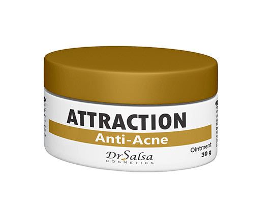
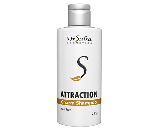
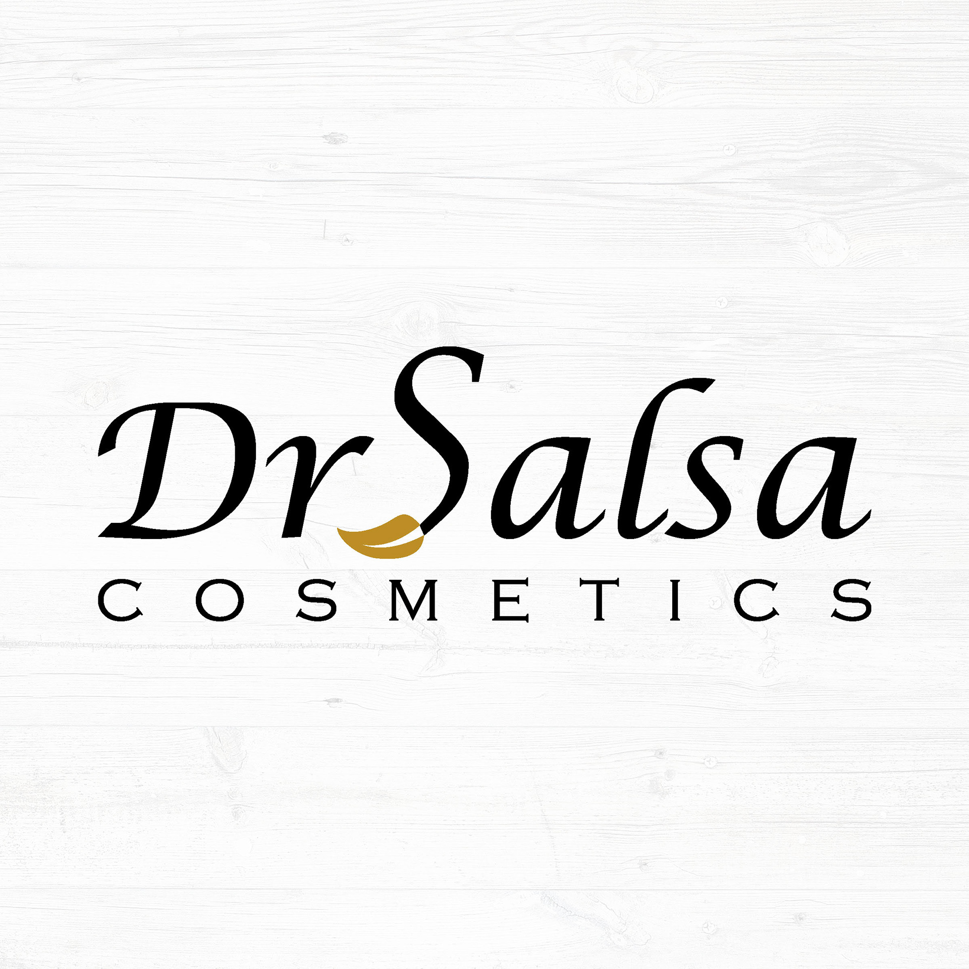
The logo combines a classic serif script with clean spaced lettering to balance professionalism with softness. The distinctive golden leaf/stroke accent beneath the "S" serves as a subtle nod to natural, organic ingredients — a signature element that ties the brand's values directly into its mark.
The gold and black color palette was chosen intentionally: black conveys authority and expertise, while gold communicates premium quality and natural richness.
Design Elements
Typography: Elegant script + spaced sans-serif for contrast and hierarchy
Icon: Gold leaf/brushstroke detail — symbolizing nature and care
Colors: Matte gold ▉ #B8952A · Jet black ▉ #1A1A1A · Clean white ▉ #FFFFFF
Style: Minimalist, premium, timeless
Product Applications
The identity was applied to two hero products from the Attraction collection:
Attraction Anti-Acne Ointment — 30g jar with gold lid
Attraction Charm Shampoo — 250g bottle, salt-free formula